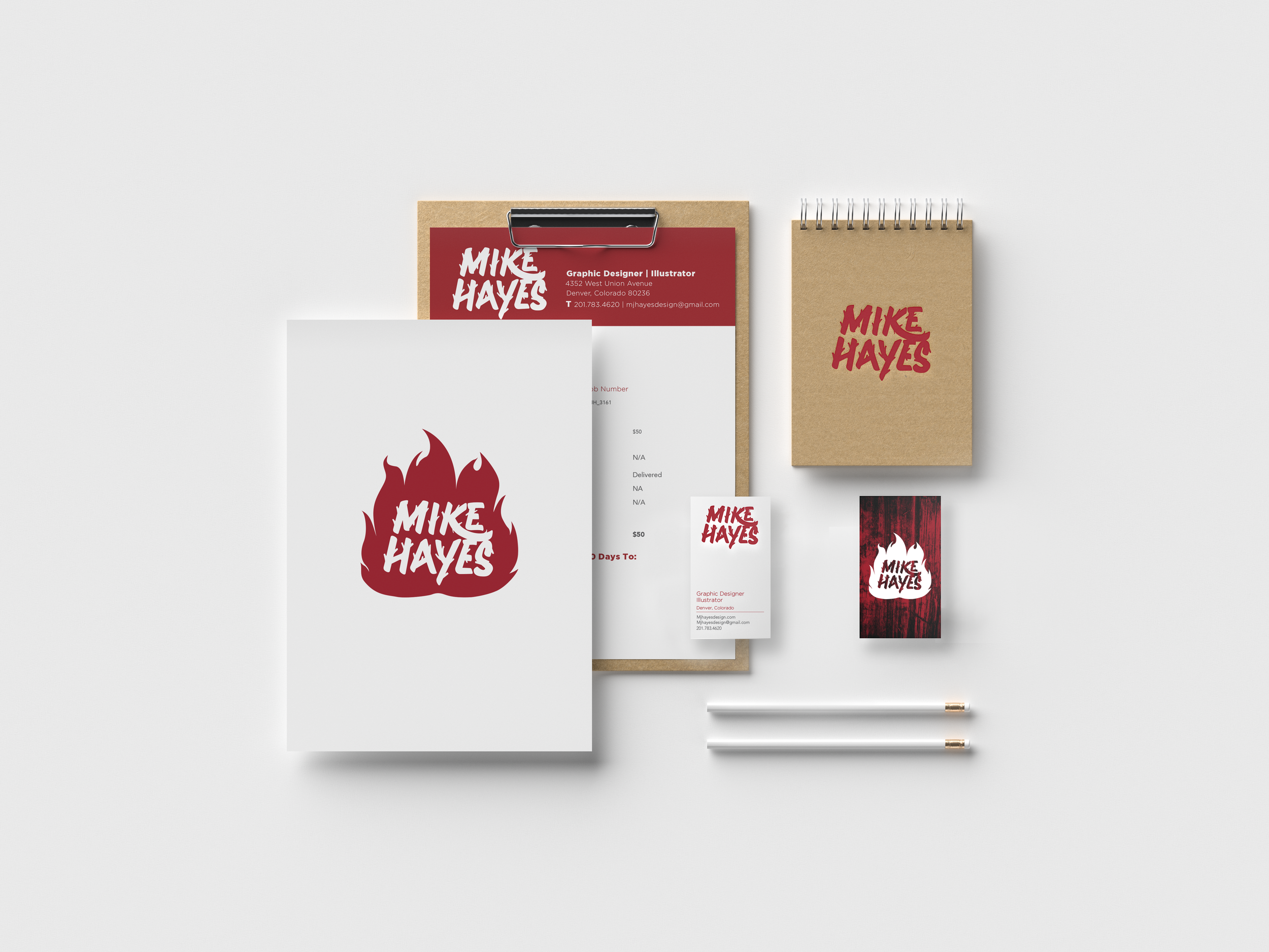


Overview
Conceptualizing my personal brand I referenced a love for all things hand done, as well as organic shapes and repetition found in nature. A sign painters casual script helped inspire my direction for the type. The container, which is used situationally only when space allows, takes inspiration and works interactively with the hand type to portray a campfire.


Type Decisions
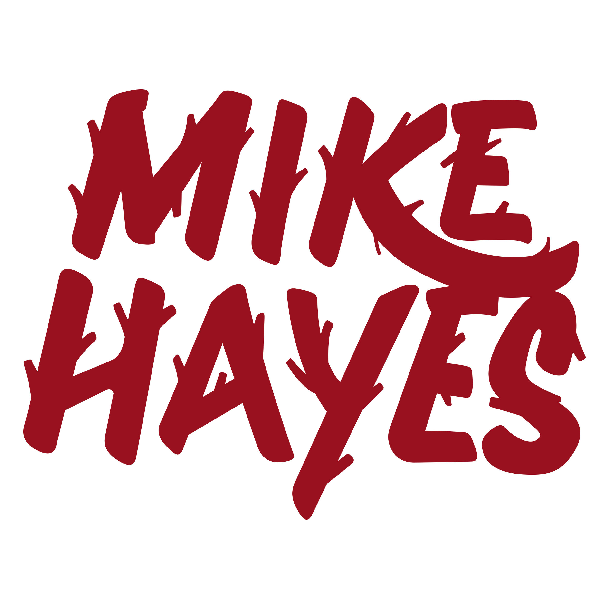
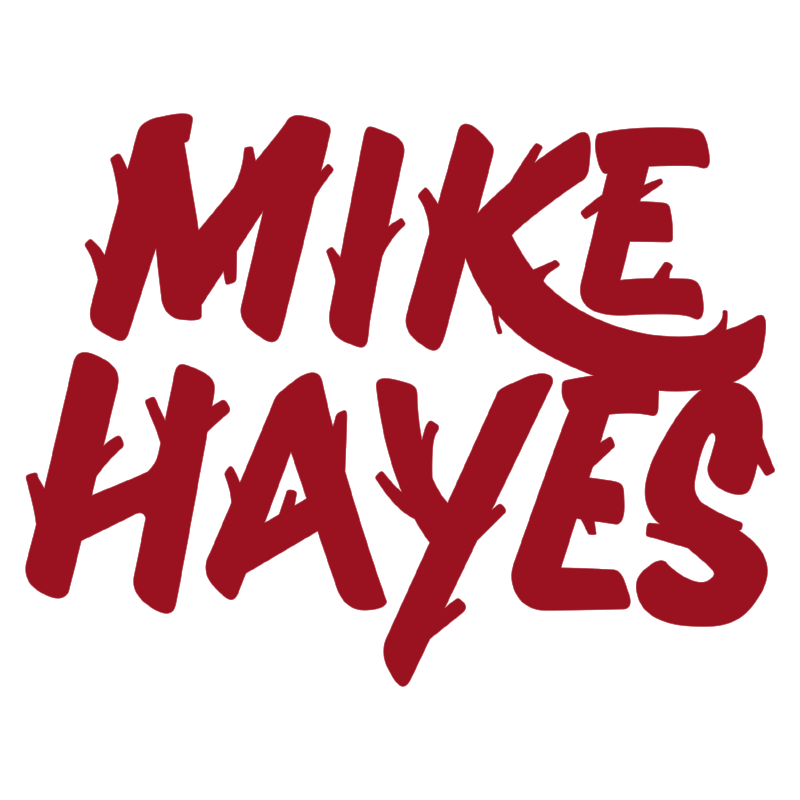
With the goal of a hand done feel in mind, hand type was used in order to create an organic and very personal look. Many iterations were gone over especially regarding the ligatures, here are just a few.
The brand
Here is the final wordmark, and the situations in which the brand would be applied with and without the container, sometimes utilizing a flood of color and knockout type to provide the desired effect that the container would create, while still keeping conservation of space in mind.